Case files AI News

Logo Fails: Four Rebrands Reversed After Backlash, and the Pattern Behind Them

Gap, Tropicana, UC and Cracker Barrel all dropped new designs after public backlash. Verified timelines, the pattern behind them, and a pre-launch test.

By Editorial Team 12 min read

A logo is the only part of a brand that people see before they have formed an opinion about it. That is why a change can feel like an insult, and why a company can lose a design in a week.

This article is a set of four case files. I chose them because each reversal is well documented by major news outlets, because they span fifteen years, and because they fail in different ways: one added a symbol, one removed a symbol, one confused a monogram with a seal, one changed the carton people recognised from across a shop.

I use only facts I could confirm in published reports, and I say when a report did not give a date or a number. I do not speculate about internal decisions. At the end, I turn the pattern into a test any small business can run before launching a new logo, including how AI logo tools can help you test several variants cheaply.

Case file 1: Gap, a small blue box (2010)

FactWhat the reports say
ChangeA new logo with a small blue box above the upper right corner of the “p” in Gap
ReactionStrong objection on social media, including Facebook and Twitter
First responseGap defended the move as more modern and invited customers to suggest improvements
ReversalAnnounced late on a Monday, in October 2010, about a week after the logo appeared on its website; the original blue-box logo returned across its channels
AdmissionThe president of Gap North America said the company had not gone about it in the right way; crowdsourcing was named as a mistake
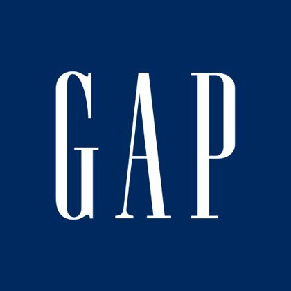
the long-running Gap logo, white serif capitals on a blue square
Before: the long-running Gap logo, white serif capitals on a blue square.
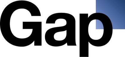
caption kehta hai “a new wordmark with a small blue box above the ‘p’
After (October 2010): a new wordmark with a small blue box above the “p”.

Two lessons stand out. First, the brand’s most recognisable asset was the old logo. Customers did not need to like it; they needed to know it. Second, the company’s invitation to customers to submit designs after the backlash created an impression of improvisation. Reports at the time describe the reversal as an apology for the process as well as the picture.

CNN’s report gave no calendar dates and did not name the designer or agency, so I have not either.

Case file 2: Tropicana, a carton people stopped recognising (2009)

FactWhat the reports say
ChangeRedesigned packaging for Pure Premium orange juice, designed by Peter Arnell
On shelvesUnder two months
Sales dataUnit sales fell 20% and dollar sales fell 19%, about $33 million, to $137 million between 1 January and 22 February (Information Resources Inc., reported by Bloomberg)
CompetitorsRival brands and private-label juice saw double-digit unit gains in the same period
ReversalThe company announced on 23 February that it would drop the new packaging
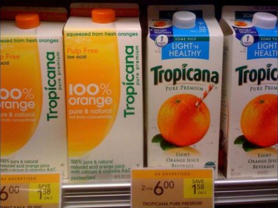
Tropicana new vs old cartons
Tropicana on a shelf, 2009: the redesigned cartons with the vertical wordmark (left) beside a carton with the familiar orange-and-straw image (right). Photo via swissmiss.

This is the only case here with a measured sales effect, and it is a reminder that the cost of a bad redesign is not embarrassment; it is shelf recognition. Shoppers who buy a product by sight did not see the product they wanted. A logo or pack that disappears into a competitor’s look has done its job badly, however fine it is on a presentation slide.

Note the careful wording: Bloomberg reported the sales window and the reversal date, but a single sales window does not prove that the design alone caused the fall. Other factors can affect a period like that. What the report does show is that the company judged the damage serious enough to reverse within weeks.

Case file 3: University of California, a monogram mistaken for a seal (2012)

FactWhat the reports say
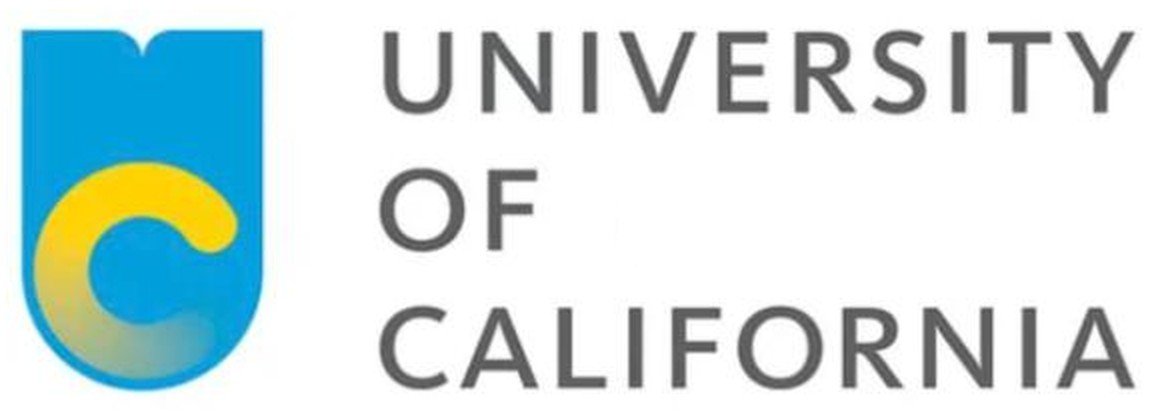
ChangeA new monogram: a yellow, fading “C” inside a blue, shield-shaped “U”, designed in the president’s office
PurposeTo distinguish systemwide documents from individual campus documents; the seal was to stay on diplomas
ReactionAn online petition to scrap the logo gathered more than 46,000 signatures; critics called it cheap and corporate-looking
ReversalSuspended on 14 December 2012; a senior vice president said it would be looked at again in due course
MisunderstandingHe said many people wrongly thought the monogram would replace the official seal
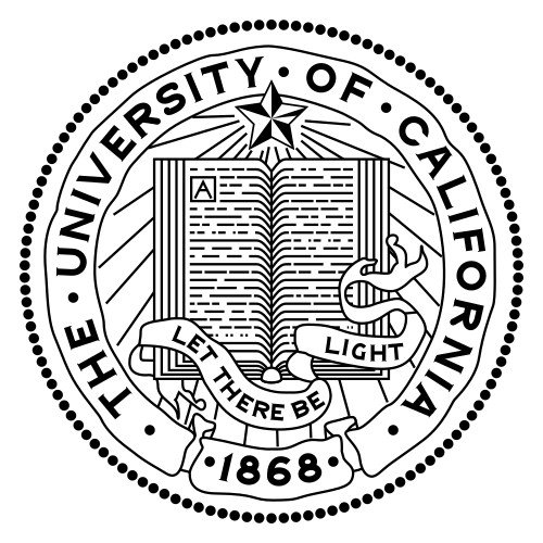
Original UC seal before change
Before: the official University of California seal, kept for diplomas.
UC 2012 monogram in a U shield
After (2012): the new monogram, a yellow “C” inside a blue shield-shaped “U”. Image via Creative Bloq.

The UC case is the cleanest example of a communication failure as much as a design failure. The university’s own explanation, that people misread the logo’s role, implies the problem was framing: if audiences believe a symbol of academic tradition is being replaced by a shield with a gradient, the logo’s merits barely matter.

The CBS report did not say when the logo was first shown or what it cost, so I leave those out.

Case file 4: Cracker Barrel, the missing Old Timer (2025)

FactWhat the reports say
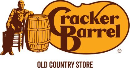
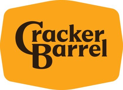
ChangeA new logo that removed the image of a man sitting in a chair beside a barrel and showed only the name; the original logo dated to 1977
RationaleThe company had said the new design represented diversity by showing many people instead of one
ReactionHeavy social-media criticism; political commentary, including a call from the US president on Truth Social to restore the old logo
Market effectCBS reported the company lost nearly $100 million in market value after the release
ReversalAnnounced on Tuesday 26 August 2025, within about a week of the unveiling; the “Old Timer” was kept
Before: Cracker Barrel logo with barrel
Before: the Old Timer figure and barrel beside the name, with “Old Country Store”.
After: Cracker Barrel logo, no figure
After (2025): the name alone on a gold shape, with the figure removed.

Cracker Barrel is the most recent case, and the one with the loudest outside voices. The report notes that commentators framed the change as politically motivated and that the White House’s deputy chief of staff said executives had told him they heard the president and customer feedback. A logo can become a symbol in a larger argument, which a design brief rarely anticipates.

Be careful with the market-value figure. It is a report of what happened to the stock after the release, not proof of what caused it, and a company’s value moves for many reasons. I include it because the outlet did, and I attribute it.

The pattern behind the four reversals

CaseRemoved or addedFamiliarity at riskSpeed of reversalOutside amplifier
Gap (2010)Added a box, changed typeBlue-box markAbout a weekSocial media
Tropicana (2009)Changed the cartonOrange-with-straw lookUnder two monthsSales data, press
UC (2012)Added a monogramSeal and traditionSuspended after a petition46,000+ signatures
Cracker Barrel (2025)Removed a figureOld Timer, since 1977About a weekPolitics, social media, stock

Four observations hold across the cases.

  1. Familiar cues are an asset. Each brand changed something that customers used to recognise it. Changing is not wrong, but it needs a reason that customers accept.
  2. The backlash arrives fast. Three of the four reversals came within weeks, and one within roughly a week. Social media shortened the cycle from months to days.
  3. Defending first made things worse. Gap initially defended the change and asked customers for ideas; Cracker Barrel had explained its rationale in advance. Neither stopped the criticism.
  4. Nobody was surprised by the principle, only by the intensity. Brand-change backlash is predictable. What organisations underestimate is how many people care.

What this means for a small business

You do not have 40 million customers or a stock price, but you do have regulars. A local cafe that changes its sign, a dentist who changes the logo on a waiting-room wall, or a bakery that changes its bag can lose the cue that makes people say “that is the place”. The same logic applies at a smaller scale.

  • Keep one anchor. A colour, a shape or a name treatment that stays.
  • Explain the change in one line. People forgive a redesign more easily when the reason is plain.
  • Ask a small group first. Ten regulars will tell you more than a poll.
  • Keep the old logo available. A reversal is faster if you still have the files.

A five-step pre-launch test, with AI tools

This is where modern tools help. A decade ago, producing five variants of a logo cost days. Today it costs minutes, which means you can test before you commit.

  1. Make three to five variants. Design.com lets you start with an AI prompt or a template route; the same business name appeared on about 18 template layouts at once in my 29 October test, which makes side-by-side comparison easy.
  2. Use chat edits for controlled changes. Ask for one change at a time (colour only, or symbol only), so you can see which change people react to.
  3. Show five to ten people each variant for five seconds, then ask what the business does and what they remember.
  4. Check recognition. Place the new and old logo side by side. If a regular customer cannot tell they are the same business, you have changed too much.
  5. Run the 32-pixel test. Shrink it. Reverse it. Put it on a dark background.
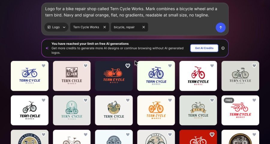
Tern Cycle Works logo templates
Design.com, template route: the Tern Cycle Works name is placed on about 18 bicycle logos at once; one carries a FREE tag (29 Oct 2026).
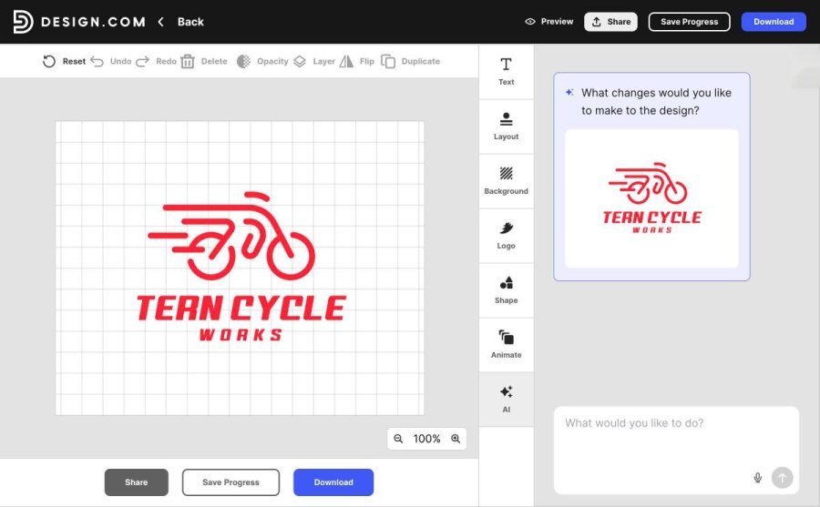
Design.com logo editor panels
Design.com editor with the AI chat box on the right: text, layout, background, logo, shape and animate panels.

Testing does not guarantee approval; it only reduces the chance of a surprise. The four case files all share one trait: the decision-makers learned about the reaction after the public did.

What does not work

  • Announcing a change as a poll after the fact. It reads as an apology.
  • Treating critics as noise. Some criticism is trolling; some is a sign that customers lost something.
  • Hiding the old logo. Removing the old asset from every touchpoint at once leaves nowhere to go back to.
  • Changing everything at once. A new name, colour, shape and type is a new brand, not a refresh.

Signal or noise: how to read a reaction

Not every complaint is a verdict. After a launch, comments arrive from three groups, and they deserve different weight.

GroupWhat they sayWhat it usually meansWeight
Regulars“I could not find your sign”, “it looks like someone else”A recognition cue was lostHigh
Commentators“This is bad design”, “who approved this”Taste, or a larger argument the logo has been pulled intoLow to medium
Staff and suppliers“It does not fit on the van / the cup / the invoice”A practical failure at small size or in one colourHigh, and easy to fix
StrangersJokes, memes, comparisonsAttention, not necessarily harmLow

The case files show what happens when an organisation weights the wrong group. Gap and Cracker Barrel were reacting to a mix of regulars and commentators; Tropicana’s data came from people who simply bought less. The difference is that sales and regular-customer comments are behaviour, while commentary is opinion. A small business can act on behaviour quickly, because it can see it: fewer walk-ins, fewer repeat orders, more “is this still you?” messages.

A useful rule is to separate recognition complaints from taste complaints. Recognition complaints say customers cannot find or trust you. Taste complaints say they would have chosen differently. The first demands action; the second can usually wait for a week of data.

A worked exercise: testing a refresh for a bike shop

To make the pre-launch test concrete, here is how I would run it for the fictional business I used in my own tool tests, Tern Cycle Works, a bicycle repair shop with a wheel-and-tern-bird mark in navy and signal orange. This is an exercise, not a claim about real customer results; no real customers were surveyed.

  1. Define the anchor. The shop decides that the navy-and-orange pairing is what regulars recognise. That stays.
  2. Define what may change. The symbol and type may change; colours may not.
  3. Produce variants. On 29 October 2026, typing the shop name into Design.com’s template route returned about 18 bicycle logos in one screen. Picking five that keep navy and orange gives a controlled set.
  4. Edit one variable. In the editor’s AI chat box, asking for a single change (“make the bird smaller”) keeps the comparison fair.
  5. Show the set. Put the current logo and the five variants on one sheet. Ask ten regulars to point to the one that “looks like the same shop”. Count.
  6. Decide by rule. If fewer than seven of ten choose the new candidate as “the same shop”, change less.

The seven-of-ten threshold is a rule of thumb I am proposing, not a published standard. Pick your own number in advance and write it down, because a threshold chosen after the results is not a test.

What to keep, what to change: a quick audit

ElementSafe to changeRisky to changeWhy
Colour paletteShade, within the same hueHueColour is often the first thing recognised at a distance
Symbol or figureSimplify the drawingRemove itCracker Barrel removed a figure used since 1977
WordmarkSpacing, weightTypeface and case togetherName shape is part of recognition
LayoutHorizontal and stacked versionsForcing one layout everywhereDifferent touchpoints need different shapes
Packaging or signAdd informationRearrange the whole frontTropicana’s carton was recognised on sight

Score each element of your current logo as “customers notice this” or “customers do not notice this”. Change the second group freely. For the first group, change only one at a time, and only with a reason you can say in one sentence.

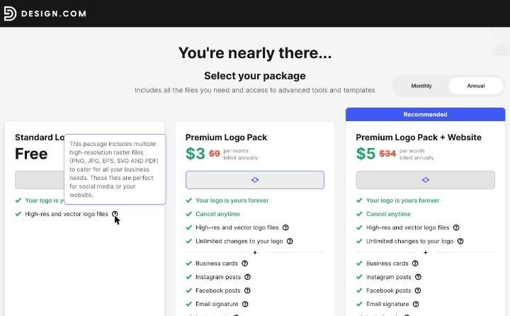
Design.com’s two routes fit this audit. The AI prompt route is useful when you are exploring something new; the template route is useful when you want familiar structures and quick comparisons; and the AI chat editor handles the one-variable edits. In my 29 October test, a template tagged FREE offered a Standard Logo Pack with PNG, JPG, EPS, SVG and PDF files listed in its tooltip, so a free variant is usable for a mock-up even before you commit.
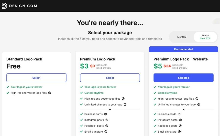
Design.com free Standard Logo Pack
Design.com checkout for a FREE-tagged template: Standard Logo Pack, Free, with high-res and vector files.
Free pack: PNG, SVG, PDF, EPS
The tooltip on that free pack lists PNG, JPG, EPS, SVG and PDF files.

I did not click through to download, and I did not read the full licence, so check the terms before you use any file in public. AI-generated logos in my earlier test led to paid tiers, so the free path applies to the FREE-tagged templates.

Plan the rollback before the launch

Every case here ended with a reversal, and every reversal was easier for the organisations that still had their old assets. For a small business, the plan is short.

  • Archive the old files in a folder named with the date, including the vector or highest-quality version you have.
  • Roll out in stages. Change digital profiles first, signage later. If the reaction is bad, the expensive item is untouched.
  • Set a review date. Decide in advance when you will look at the data, for example after two weeks of orders.
  • Write the one-line reason. “We simplified the mark so it reads on a phone” is something staff can repeat.

None of this is glamorous, but it is the difference between a small adjustment and a public retreat.

Verdict

The four reversals look different, but they share a structure: a familiar cue disappeared, a vocal audience noticed, and the organisation changed course within weeks. For companies at any size, the useful question is not “is the new logo good?” but “what will people lose when they see it, and have we told them why?”

Facts in this article come from the published reports linked below. Where a report omitted a date, a number or a name, I have said so rather than fill the gap.

Frequently asked questions

Which companies reversed a logo after backlash?

Documented cases include Gap (2010), Tropicana’s packaging (2009), the University of California (2012) and Cracker Barrel (2025). Each dropped a new design within weeks or months of launch.

How quickly did Gap reverse its logo?

CNN reported that the new logo appeared on its website the week before and that Gap announced the reversal late on a Monday in October 2010, so about a week.

What happened to Tropicana sales after its redesign?

Bloomberg reported, citing Information Resources Inc., that unit sales fell 20% between 1 January and 22 February; the company announced on 23 February that it would scrap the new packaging.

Why did Cracker Barrel reverse its logo?

CBS reported that after heavy criticism, including political commentary, the company announced on 26 August 2025 that it would keep its “Old Timer” logo.

How can I avoid a logo backlash?

Keep one familiar anchor, explain the change in one line, test variants with a small group, and keep the old files so you can revert.

Can AI logo tools help me test a new logo?

Yes. Tools such as Design.com can produce many variants quickly, from an AI prompt or from templates, so you can compare options with real customers before launch.